CLIENT
Dayton Diaper Depot
PROJECT
Brand Identity
Strategy
Positioning
Creative Direction
Website Design
ROLE
Creative Director, Copywriter, Designer, Strategist
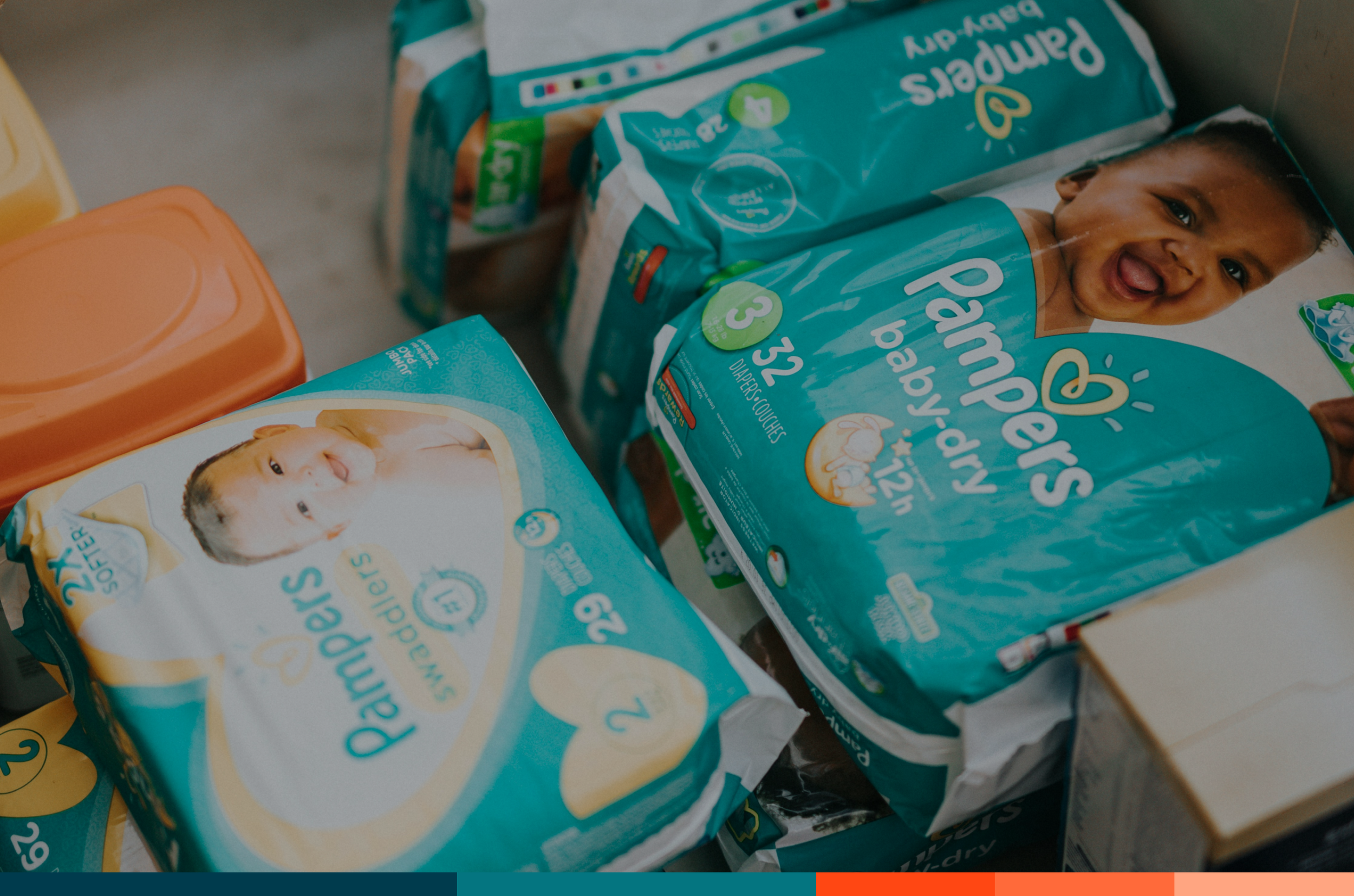
Dayton Diaper Depot is a Dayton-based nonprofit ensuring families have access to clean diapers and essential hygiene products. Their mission is to strengthen the community’s social, economic, and health outcomes by meeting a basic need no child should go without.
I was lucky enough to be a part of Dayton Diaper Depot from its early beginnings, helping shape a warm, trustworthy brand that reflected their mission. The goal was to create a clear, approachable identity that communicated the impact of providing diapers to families in need.

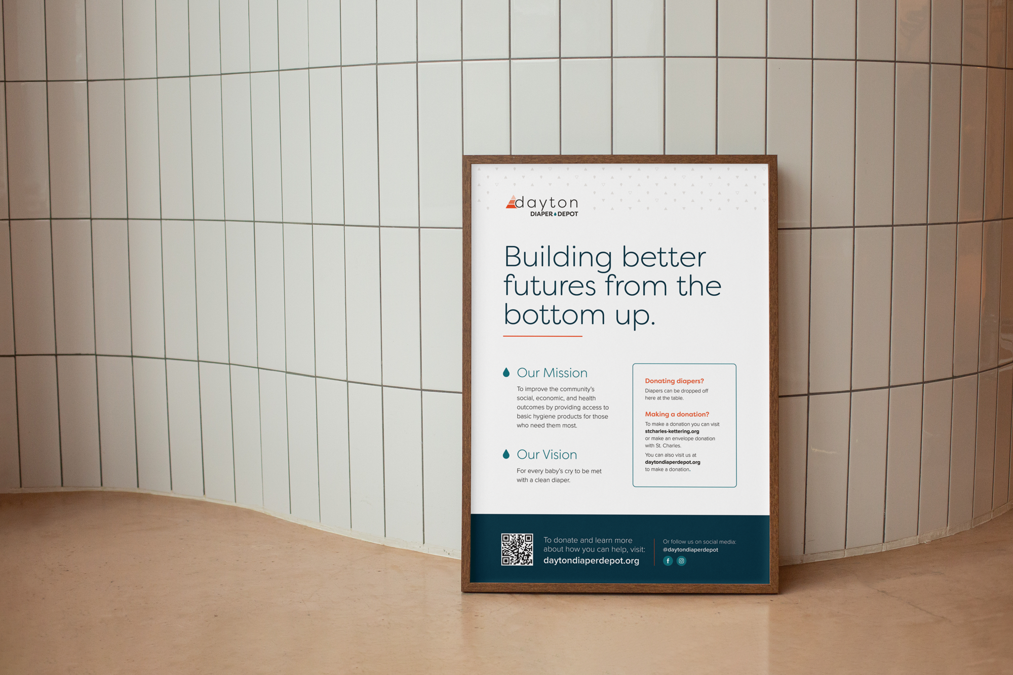
Visual language
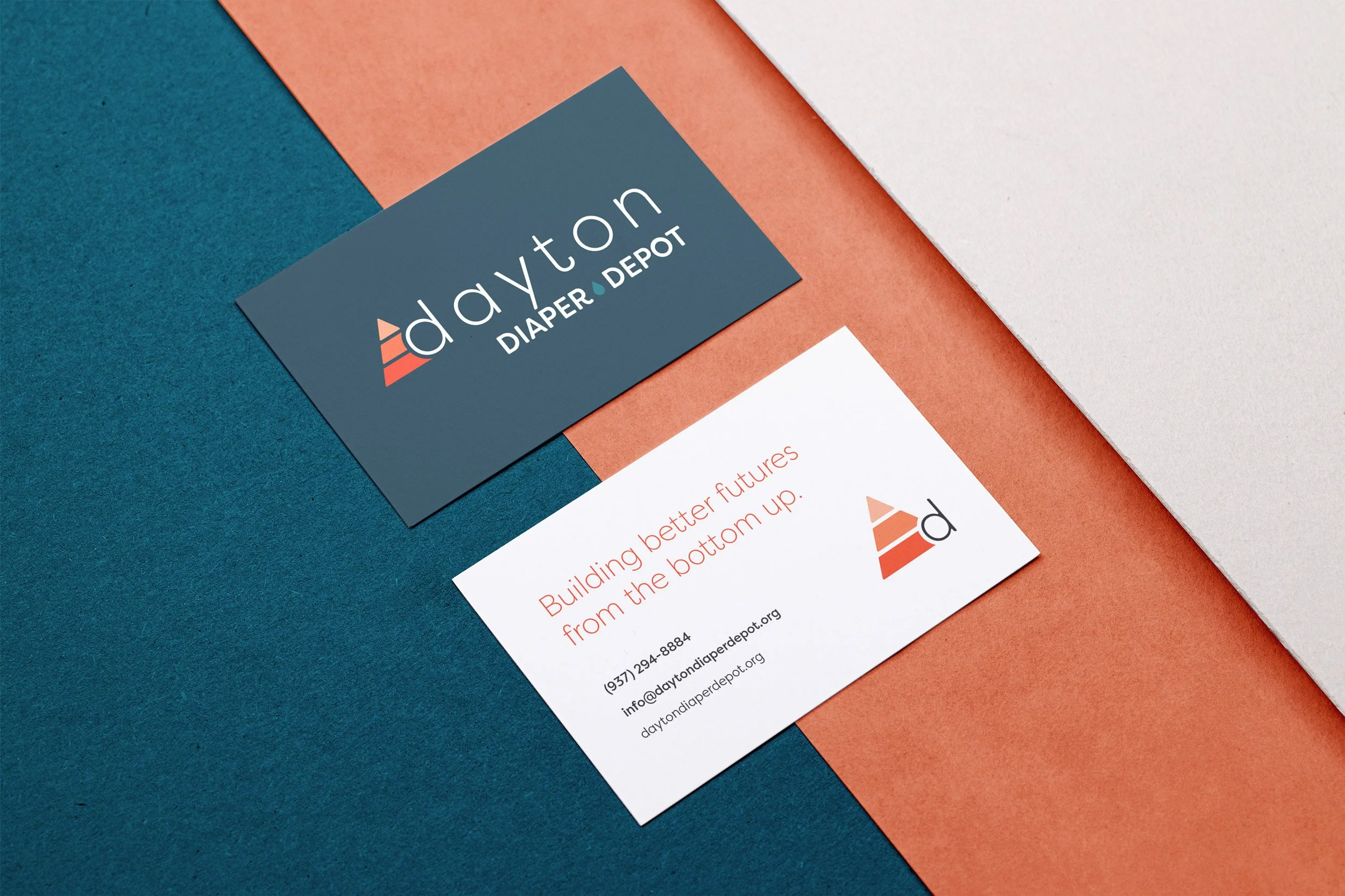
To reinforce their focus on caregiving and community support, we introduced a soft, uplifting color palette paired with friendly, modern typography. The visual language balances simplicity with heart, using gentle shapes and clean layouts to keep the emphasis on accessibility and impact.
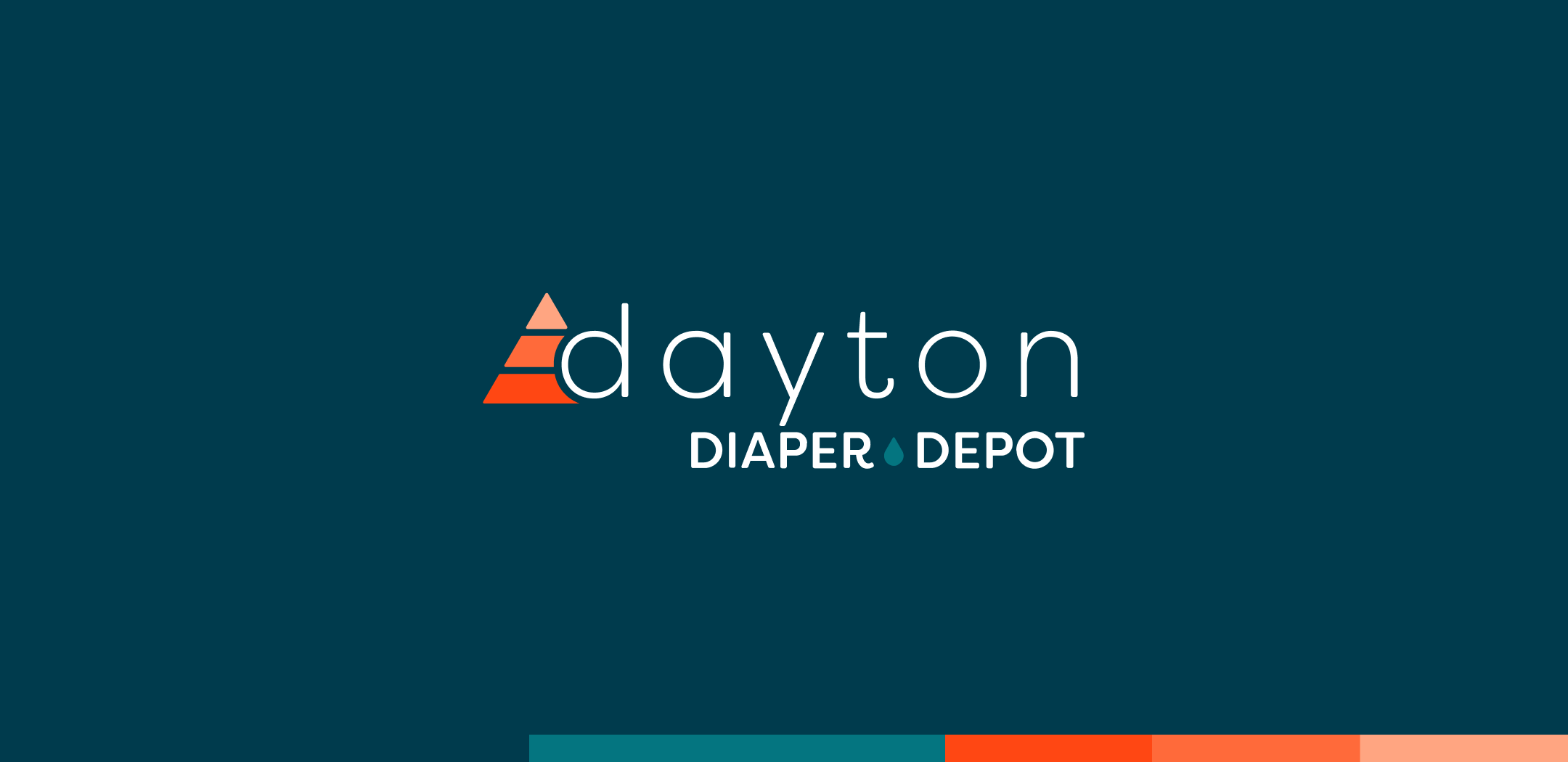
The Logo
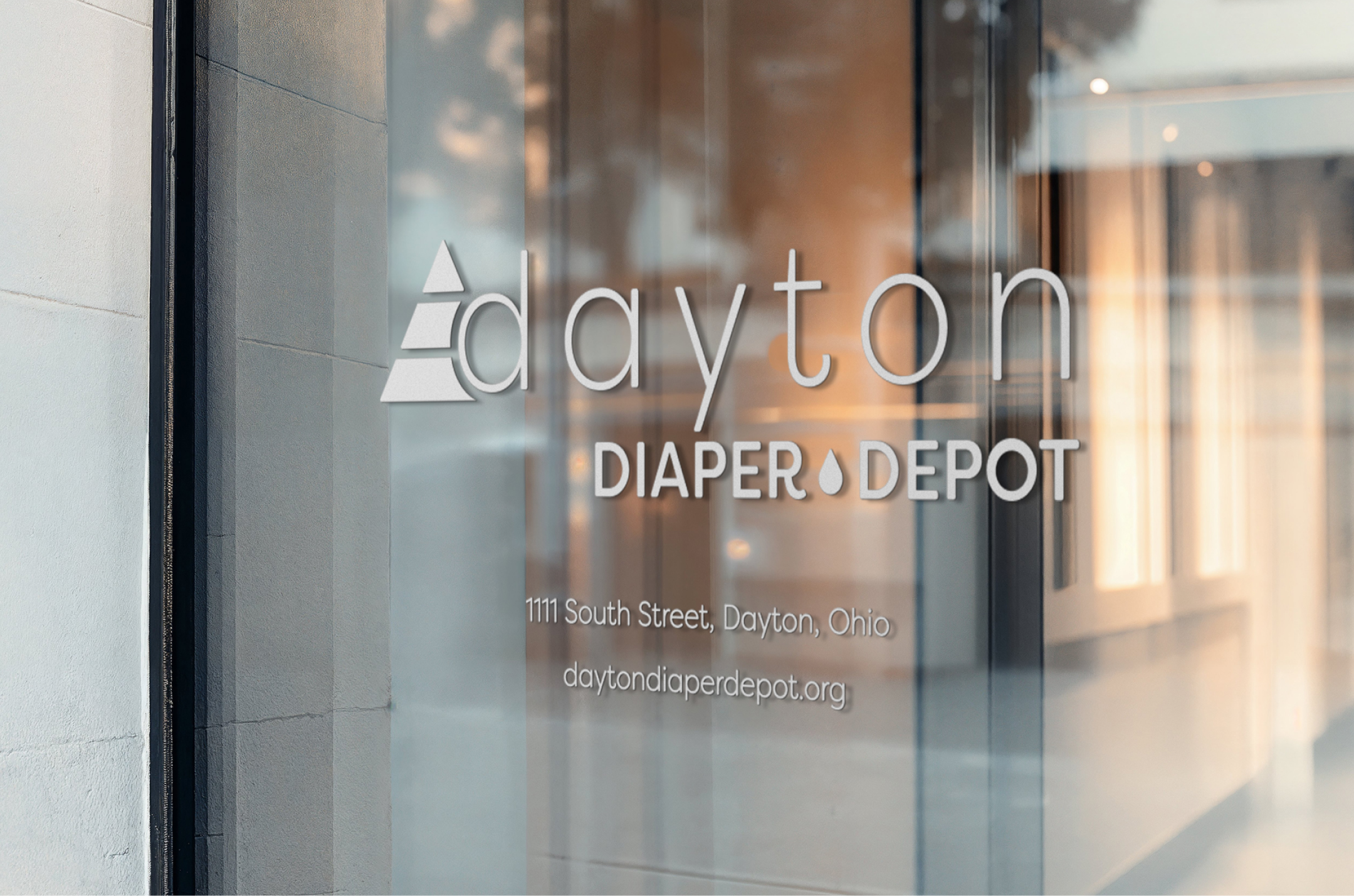
The Dayton Diaper Depot logo is built around a three-tiered pyramid, symbolizing the organization’s long-term vision to expand beyond baby diapers into adult incontinence products and period care.
This layered structure represents growth, stability, and the widening impact of their mission.
The shape also nods to a piece of Dayton history—the Dayton Triangles—subtly rooting the brand in the community it serves.
At the center sits a small droplet, symbolizing both the product’s purpose and a deeper idea: hope, renewal, and the life-changing impact of meeting a basic need.

Brand Values
-
Dayton Diaper Depot is built on the belief that every family deserves to meet their child’s most basic needs with comfort and confidence. The brand leads with empathy—supporting parents, honoring their challenges, and ensuring every baby is cared for with dignity.
-
The organization thrives on collective action. Whether through donations, volunteering, or partnerships, the brand emphasizes that real change happens when the community comes together. Every contribution strengthens the social, economic, and health foundations of Dayton families.
-
At its core, the brand is optimistic. From the symbolism in the logo to the language across the site, DDD highlights how small acts—like donating a pack of diapers—create meaningful, long-term impact. The brand inspires supporters to help build better futures, one diaper at a time.